
Three Rules for Writing and Designing
I gave a presentation once to a group of high schoolers and college students. It was about writing, and it had to fill 15 minutes worth of time. The constraint made it an interesting project. I've spent years thinking about writing, reading everything possible, and writing in as many modes as I could. At the time, I was also beginning my fascination with design.
I find good design, and good discussion about design, to be extremely realistic and conscious about the user in a way we never discussed when I was in school for public relations, advertising, or writing. In fact, if anything, each of those disciplines places themselves somewhat above the audience. Each assumes a stance of superiority: we have more information than the audience; we present to the audience in controlled and calculated ways; and we will unveil information as we see fit.
My education happened when I started disagreeing. For years as a student, you're encouraged to repeat what the teacher says, and that cycle is a vicious one. I'm sure there are plenty of students who got through school without ever expressing their own opinions.
One example comes to mind. In one class, I was the only student who didn't like The Collected Works of Billy the Kid by Michael Ondaatje. I found it pretentious, and I didn't like the way it took the reader for granted. At the time, and today, I don't appreciate stories that force you outside the narrative. For me, it's a matter of immersion, and I felt removed from that book. It makes its readers try to figure out what’s happening, and it offers no clarity. It doesn’t invite readers in; it locks them out.
"In fact, if anything, each of those disciplines places themselves somewhat above the audience. Each assumes a stance of superiority: we have more information than the audience; we present to the audience in controlled and calculated ways; and we will unveil information as we see fit.
Now, a year or so later, imagine my discovery of design, and more importantly, the beginnings of my exploration into how designers approach their craft. The consciousness of how a user interacts with objects in industrial design. The clear and beautiful conveyance of data in informational design. The pixel pushing in graphic design and typography. The manipulation of motivation and entertainment in game design.
I was in heaven. It changed my life and how I approach my work.
I mention all of this because I think writing is a form of design. Great writing, and great communication in general, is all dependent on one’s ability to convey information. Great stories work because they invite readers in, because they become invisible, because they envelop and affect.
In that presentation on writing, I listed three rules. I’ve used these rules again and again in presentations and directive documents. Here they are:
Know what you want to say.
Say it clearly.
Say it concisely.
Simple ideas, but they’re often difficult to execute. People tend to let too many things get in the way of their point in business, emails, and presentations. (And also in long, meandering essay-blogs…)
But again, I think these three steps apply to not only to writing, but design and problem solving, in very important ways. Let me elaborate:
Know what you want to say.
There a great scene in Planes, Trains and Automobiles in which Steve Martin has had enough of his trip from hell, and his talkative and bumbling companion, played by John Candy. Martin finally blows up at Candy:
“You know everything is not an anecdote. You have to discriminate. You choose things that are funny or mildly amusing or interesting. You're a miracle! Your stories have none of that. They're not even amusing accidentally! [...] Here’s an idea — Have a point! It makes it so much more interesting for the listener!”
In short: have a point, a reason, or a message when starting any project. Then focus on making it. In general, if an element isn’t necessary for your point, then remove it.
Now, I understand that there may be different points. Not everything has one singular purpose. But everything should have a primary focus. Without clear distinctions between primary and secondary focuses — without a hierarchy of priority — things get confusing. Good creators-of-things understand this. Good comedians know to be funny foremost. Good writers know to focus on plot and clarity. Good designers focus on removing barriers to use. A hierarchy of priority allows clarity in workflow as well as a clear path to achievement.
Say it clearly.
I learned how to write five-paragraph essays in middle school and high school. I’ll get a little more into the five-paragraph form in a bit — it also applies to the next point — but for now, I think it’s a great example of clarity and form.
Here’s why: they offer structure and require the writer to focus. Before the writer begins, he must decide on a main point (i.e., the thesis), and then back it up with supporting points. Everything attributes to making the point clearly understood. For example:
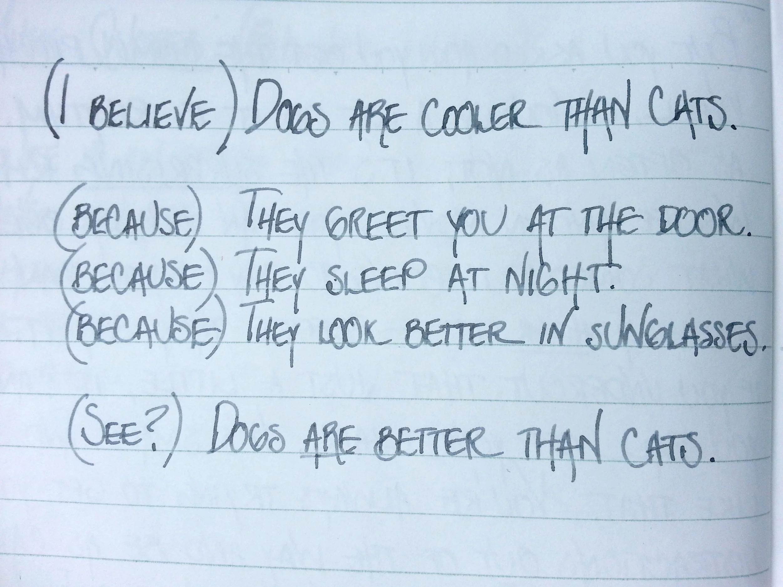
In these notes, I’ve decided upon my main idea: Dogs are cooler than cats. I also have three reasons why. To write this essay, I’d make my point initially in an introductory paragraph, and then I’d make each supporting point in its own paragraph. Seems simple enough, and the hierarchy of ideas seems clear enough. But here’s a way to think about it differently and better understand the structure. You can just invert the diagram.

The inversion helps reveal the structure a different way: all of the supporting points add up to proving the thesis.
This form works because it came from legal discourse. Think of a lawyer making his opening to the jury: the defendant is either guilty or not guilty. The case proceeds, and the lawyer offers additional argument to support his initial claim. Then he closes, re-emphasizing his argument and the reasons why the jury should believe him.
For this example, If I only had two reasons why I thought dogs were better, then I’d only write two supporting paragraphs. If I thought the argument needed five supporting points, then I’d write five supporting paragraphs. But that kind of consideration isn’t nearly as important as the thesis and a clear hierarchy of information.
This applies in a lot of contexts from business and design. In order to allow the audience, the user, or the recipient to act, the message or underlying purpose must be clear. Otherwise, there’s no chance that your project will have any impact or see any results.
Say it concisely.
When I got to college, the five-paragraph essay became somewhat of a maligned form. But rather than explaining and improving the form, we were told to vary it because five paragraphs were too obvious and cookie-cutter. As students, that means we wrote six or seven paragraphs instead.
I get what the teachers meant now. They wanted us to use more supporting points if we had them, and they wanted us to add paragraphs if we needed to elaborate. But we just added points and paragraphs to hit the new marks. The same thing happened with any assignment with a minimum page count. Students filled the space, regardless of whether the writing was necessary.
So how do you know what’s extraneous? Most of the time, when I’m writing, a reread out of my working context will do the job. I get away from my computer, and read it on my Kindle. Or I print out some work and annotate it on my lunch break. The change of setting and context helps me see my work with an analytic eye and emotional distance.
This is where style often comes into play. An ornate flourish, or a quick anecdote, can come with its own benefits. As a creator-of-things, it’s important to be able to tell what’s important and what’s not. If you can’t tell necessary from extraneous, then you need to enlist help. Insight is why students workshop in creative programs, and it’s why businesses do a lot of user testing. But even after user tests and focus groups, designers have to decide on the insights to consider and the insights to ignore.
To sum up, remember the audience, the people who read, use, or interact with your finished product. For their sake, sometimes it’s fine to be brief. Sometimes, items don’t need instruction manuals. Sometimes, the audience doesn’t need to know how the thing they like was made. If you can remove parts and the whole thing still works or makes sense, then those parts were unnecessary. Simplicity is worth the energy, and people will appreciate the effort you put into making their lives a little easier.